

Alfa Romeo:

Alfa Romeo, the car manufacturer and pride of Italy, traced its beginnings to France. In 1910, Milan aristocrat Cavaliere Ugo Stella collaborated with the French car company Darracq to market the line in Italy. When the partnership failed, Stella moved the company and renamed it Anonima Lombarda Fabbrica Automobili (Lombard Automobile Factory, Public Company) or A.L.F.A.
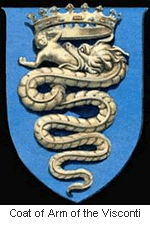 Alfa Romeo’s distinctive logo was created in 1910 by a draftsman named Romano Cattaneo. One day, while waiting for a tram at the Piazza Castello station in Milan, he was inspired by the red cross in the Milan Flag and the Coat of Arms of the noble House of Visconti, which featured a biscione (grass snake) with a man in its jaws, symbolizing "Visconti’s enemies that the snake [was] always ready to destroy." (Source) Two Savoia dynasty knots separated the words ALFA and MILANO.
The Romeo part came in 1916 when Neapolitan businessman Nicola Romeo bought the company and converted its factories to produce munitions and machineries for World War I. After the war, the company went back to producing cars and took on its owner’s last name to become Alfa Romeo.
Aston Martin:

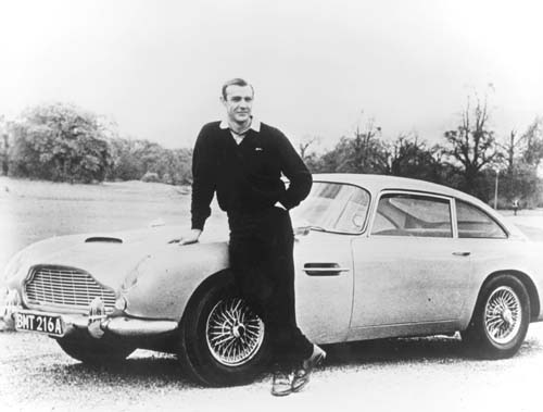
We can’t talk about Aston Martin without mentioning James Bond. In 1959, Ian Fleming put his super spy James Bond in an Aston Martin DB Mark III. When it was made into a movie in 1964, Bond drove an updated, supersleek silver Aston Martin DB5 (complete with machine gun, passenger ejector seat, and revolving number plates!)
Interestingly, Ian Fleming himself didn’t drive Aston Martin. He preferred the 1963 Studebaker Avanti!
Audi:
German engineer August Horch, who used to work for Karl Benz, founded his own automobile company A. Horch & Cie in 1899. A decade later, he was forced out of his own company and set up a new company in another town and continued using theHorch brand. His former partners sued him, and August Horch was forced to look for a new name.
When Horch was talking to his business partner Franz Fikentscher at Franz’s apartment, Franz’s son came up with the name Audi:
During this meeting Franz’s son was quietly studying Latin in a corner of the room. Several times he looked like he was on the verge of saying something but would just swallow his words and continue working, until he finally blurted out, "Father – audiatur et altera pars… wouldn’t it be a good idea to call it audi instead of horch?". "Horch!" in German means "Hark!" or "listen", which is "Audi" in Latin. The idea was enthusiastically accepted by everyone attending the meeting. (Source: Wikipedia, A History of Progress (1996) – Chronicle of the Audi AG)
And so Audiwerke GmbH was born in 1910. In 1932, four car makers Audi, Horch, DKW, and Wanderer merged to form Auto Union. The logo of Auto Union, four interlinked rings that would later become the modern Audi logo, was used only in racing cars – the four factories continued to produce cars under their own names and emblems.
| Four car companies became Auto Union (1932) Fast forward to 1985 (skipping a whole lot of history), when Auto Union ultimately became the Audi we know today BMW:
In 1913, Karl Friedrich Rapp and Gustav Otto founded two separate aircraft factories that would later merge to form BMW or Bayerische Motoren Werke AG (Bavarian Motor Works). Rapp and Otto actually had little to do with BMW’s manufacturing of cars. Josef Popp, Max Friz and Camillo Castiglioni were the ones who played big roles in making BMW a modern car manufacturer.
The circular BMW logo was a representation of a spinning propeller of a Bavarian Luftwaffe. At the time, aircrafts were painted with regional colors and the colors of the Bavarian flag were white and blue. It is said that the pilot saw the propeller as alternating segments of white and blue, hence the logo. The roundel was a nod to Karl Rapp’s original company.
During World War I, BMW was a major supplier of airplane engines
(and later airplanes such as the Red Baron) (thanks Redditors!) to the German government. After the war, Germany was forbidden by the Treaty of Versailles to manufacture airplanes and BMW was forced to change its business: it first made railway brakes before making motorized bicycle, motorcycles and cars.
Update 3/6/08: Neatorama readers Dan S. and Bruce Kennedy who pointed out that the idea of BMW logo being derived from spinning propeller was actually anadvertisement by the company (scroll down about halfway). Also thanks to klaus who pointed us out to the logo of EMW, which BMW took over in 1928.
Buick:
The Buick Motor Company was founded in 1903 by David Dunbar Buick, a Scottish-American inventor who invented the overhead valve engine. If you didn’t recognize the name, you’re not alone – but remember this: Buick, a high school drop out founded a company that later became the world’s largest auto company, General Motors.
At 15 years of age, Buick dropped out of school to work for a plumbing fixture manufacturer. When that business failed, Buick and his friend took it over – but within a few years, Buick had an argument with his partner because he preferred to spend his time tinkering with car engines. Buick sold his share in the company and quit.
With the money, Buick founded the Buick Motor Company and within a few years ran it to the ground. He was kicked out of the company by his partner William "Billy" Durant in 1906 and later sold his stock for a mere $100,000. Had he held on to his shares, it would’ve been worth well over $100 million today. In his later years, Buick held low-paying jobs and couldn’t even afford a telephone. He died penniless as an inspector at the Detroit School of Trades. Ironically, years later Durant himself would be forced out. General Motors, the company that Durant built, refused him pension and he died almost penniless. (Source)
Back to the logo story: Early Buick logos were variations of the cursive word "Buick." In 1930s, General Motor Styling researcher Ralph Pew found a description of the Scottish "Buik" [sic] family crest and decided to use it as a radiator grille decoration. In 1960, the logo incorporated three such shields, to represent the three Buick models then built: LeSabre, Invicta, and Electra.
In 1975, Buick changed their logo to a hawk named "Happy" with the launch of their Skyhawk line. However, in the late 1980s, as the Skyhawk car was retired, Buick went back to the tri-shield logo.
Cadillac:
When Henry Ford left his second automobile company, Henry Ford Company (see below), his financial backers tried to liquidate the company’s assets. An engineer named Henry M. Leland persuaded them to continue the company instead. They listened, and so Cadillac was born.
Cadillac’s first logo was based on a family crest of a minor aristocrat that the company was named after: Antoine de La Mothe, Seigneur de Cadillac (Sir of Cadillac). In 1701, de La Mothe founded Fort Pontchartrain which would later become Detroit. Cadillac was named after de La Mothe in 1902, following a bicentenary celebration of the founding of the city.
Problem was, de La Mothe was never a nobility! Born Antoine Laumet, de La Mothe was forced to leave France for America under a mysterious circumstance (some say he committed a crime or was unable to pay his debt). In the New World, he was able to assume a new identity and cobbled together a famiy crest with elements "borrowed" from, shall we say nobler sources.
In 1998, Cadillac had a new design philosophy called "art and science" and had its logo redesigned. Gone were the six birds called the merlettes, the crown, and the entire fabricated de La Mothe family crest as the company tried to shake up its stodgy image. The new logo made its debut a few years later, looking positively like it was made by Piet Mondrian!
Fiat:
Fiat, then named Fabbrica Italiana Automobili Torino (Italian Automobile Factory of Turin), was founded in 1899 by a group of investors, including Giovanni Agnelli who later became its Managing Director. Agnelli bought his shares for $400 (about $10,000 in 2007 money). It’s worth billions now, and there had been an Agnelli in Fiat management ever since. Regardless or perhaps because of its wealth, the Agnelli clan remained a fractious and complicated group of people.
Supposedly, the famous Fiat "scrabble tiles" logo of the 1960s was designed by the company’s Chief Designer who was driving past the Fiat factory during a power outage and saw an outline of the factory’s neon sign against the dark sky (Source: The Language of Auto Emblems)
Ford:
Most people know that Ford was founded by (who else?) Henry Ford. What most people didn’t know was that this was his third automobile company. Ford experimented with cars while working for Thomas Edison, and left to found his first auto company, The Detroit Automobile Company, which went bankrupt in just 2 years. He then built a race car and founded Henry Ford Company. Ford left that one after just one year (the company later became Cadillac – see above).
In 1902, Ford went on to create his third automobile company, the Ford & Malcomson, Ltd., and almost lost that one when sales were slow. He was unable to pay his bills to John and Horace Dodge, who supplied parts. Ford’s partner brought in a group of investors and even convinced the Dodge Brothers to accept shares in the company, which was renamed Ford Motor Company. Later, the Dodge Brothers went on to form their own car company (can you guess what?)
In 1909, Childe Harold Wills, Ford’s first chief engineer and designer (who also help to design the Model T), lend a script font that he created to make his own business card, to create the Ford logo. The famous blue oval was added later for the 1927 Model A – it remained in use until today.
Mazda:
Mazda began its life in 1920 as the Toyo Cork Kogyo Co. in Hiroshima, Japan. At the time, there was a cork shortage because of World War I, so the company was founded to process a cork substitute made from the bark of an Abemaki or Chinese cork oak tree. It was a good idea at the time, but shortly afterwards Japan could get real cork again and the company foundered.
In 1927, Jujiro Matsuda came onboard and the company began manufacturing tools, three-wheeled "trucks" and then cars. After World War II, the company formally adopted the name Mazda, which depending on who you ask, stood for the Zoroastrian god Ahura Mazda or an anglicized pronunciation of Matsuda the founder’s name (or both).
In the 1936 logo, the M shaped curve was inspired by the emblem of Hiroshima city. The 1991 and 1992 logos symbolized a wing, the Sun and a circle of light. Mazda’s current logo, nicknamed the "owl" logo, was designed by Rei Yoshimara in 1997. The stylized "M" was meant to look like stretched wings, but many people saw a stylized tulip instead.
Mercedes-Benz:
The modern Mercedes-Benz traced its lineage to a 1926 merger of two car companies,Daimler-Motored-Gesellschaft or DMG, founded by Gottlieb Daimler (along with Wilhelm Maybach), and Benz & Cie, founded by Karl Benz. Both Daimler and Benz worked independently to invent internal combustion-powered automobiles. Their factories were actually just 60 miles apart, yet they didn’t know of each other’s early work.
After World War I, the German economy was in tatters, and to survive, the two companies formed a syndicate in 1924, where they would continue to sell their separate brands but would standardize design, share purchasing and advertising. In 1926, however, the two companies merged into Daimler-Benz.
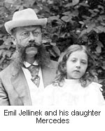 The name "Mercedes" came about in 1900. A wealthy European businessman and racing enthusiast named Emil Jellinek began selling Daimler’s cars. He wanted a faster car, and specified a new engine to be designed by Maybach and to be named after his 10-year-old daughter’s nickname, Mercédès or Spanish for The name "Mercedes" came about in 1900. A wealthy European businessman and racing enthusiast named Emil Jellinek began selling Daimler’s cars. He wanted a faster car, and specified a new engine to be designed by Maybach and to be named after his 10-year-old daughter’s nickname, Mercédès or Spanish for "grace." "Mercy" (See below)
Jellinek was quite a character. He used to pepper DMG’s engineers with colorful suggestions and criticism such as "Your manure wagon has just broken down on schedule" and "You are all donkeys". However, as he actually sold a lot of cars, he was tolerated and even listened to. Later, Jellinek would add Mercedes to his own and became Emil Jellinek-Mercedes. (Source: My Father Mr. Mercedes by Guy Jellinek-Mercedes and MBUSA Biographies)
The star in Daimler’s logo came from an old postcard where Gottlieb Daimler had drawn a star above the picture of his house and wrote that "this star would one day shine over [his] own factory to symbolize prosperity." The three-pointed star symbolized Daimler’s ambition of making vehicles "on land, on water and in the air." (Source: Daimler)
After the merger, a new logo was designed. It combined the symbols of the two companies: the three-pointed star of DMG and the laurel wreath of Benz.
Update 2/18/08: There’s a dispute on the origin of the name “Mercedes.” According toBaby Names World, Mercedes is a girl’s name of Spanish origin meaning “Mercy.” It was taken from the Virgin Mary’s liturgical title “Maria de las Mercedes” (Mary of the Mercies; ‘Our Lady of Ransom’):
Latin ‘mercedes’ originally meant ‘wages’ or ‘ransom’. Mitsubishi: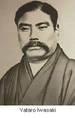 In 1854 feudal Japan, a man named Yataro Iwasaki, son of a provincial farmer whose grandfather sold the family’s samurai status to settle some debt, began his career on the wrong foot: he was called home from school at the age of 19 when his father was injured in a dispute with the village leader. Iwasaki asked a local magistrate to hear his case, and when refused, accused the man of corruption. Iwasaki was promptly jailed for seven months. In 1854 feudal Japan, a man named Yataro Iwasaki, son of a provincial farmer whose grandfather sold the family’s samurai status to settle some debt, began his career on the wrong foot: he was called home from school at the age of 19 when his father was injured in a dispute with the village leader. Iwasaki asked a local magistrate to hear his case, and when refused, accused the man of corruption. Iwasaki was promptly jailed for seven months.
Fast forward to 1868: Iwasaki was working for the Tosa clan when the Meiji Restoration abolished Japan’s feudal clan system. He acquired Tsukumo Shokai, the Tosa clan’s shipping business and renamed it Mitsubishi in 1873.
It was a fourth-generation Iwasaki, a man named Kayota Iwasaki, who turned Mitsubishi into a giant corporate group that included an automobile manufacturing company, Mitsubishi Motors.
The name Mitsubishi was a combination of the words "mitsu" (three) and "hishi" (water chestnut, used in Japan to mean a rhombus or a diamond shape). The official translation of the name was "three diamonds."
The Mitsubishi logo was a combination of the Iwasaki family crest, three stacked diamonds, and the three-leaf crest of the Tosa Clan.
Peugeot:
Peugeot got its start in 1812 in Montbeliard, France, when two brothers, Jean-Pierre and Jean-Frédéric Peugeot converted their windmill into a steel mill. Their first products were rolled steel for saw blades and clock springs, as well as cylindrical steel rods. For decades, the Peugeot family business made metal goods, machine tools, crinoline dresses, umbrellas, wire wheels, irons, sewing machines, kitchen gadgets and by 1885, bicycles.
Indeed, Peugeot’s entry into the automobile business was by way of bicycles. At the time, the company was one of the largest bicycle manufacturers in France. In 1889, Armand Peugeot created the company’s first steam-powered car. A year later, he abandoned steam in favor of gas-powered internal combustion engine after meeting Gottlieb Daimler.
The Peugeot "lion" logo was designed by jeweler and engraver Justin Blazer in 1847. It was based on the flag of the Région Franche-Comté. The logo was stamped on Peugeot kitchen gadgets to denote the quality of their steel. It took Armand 14 years to convince his family that cars could be a moneymaker. Only then did they allow him to use the Peugeot lion logo. (Source: Independent)
Now, you may not drive a Peugeot car, but I bet you’ve used a Peugeot invention of 1842: the peppermill. The mill’smechanism was so reliable that it remained virtually unchanged until today.
Renault:
Louis Renault was 21 when he made his first car in the backyard of his parent’s home. He soon got orders for cars, so in 1898, along with his brothers and friends, Louis opened the company Société Renault Frères in Boulogne-Billancourt, France.
The first Renault logo, drawn in 1900 featured the three initials of the Renault brothers: Louis, Ferdinand and Marcel. In 1906, the logo changed to a front end of a car enclosed in a gear wheel.
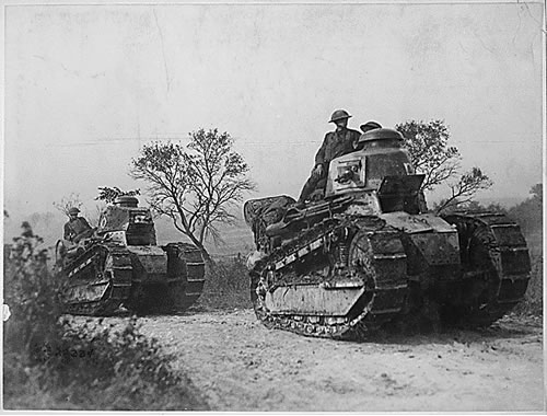
Renault FT-17 tank, driven by American troops, going forward to the battle line in the Forest of Argonne. (Source: The National Archives)
During World War I, Renault manufactured light tanks for the Allies called the Renault FT-17. This was so popular that after the war, Renault actually changed its logo into a tank. The diamond shape was introduced in 1925 and remained until today. The modern Renault logo was created in 1972 by Victor Vasarely [offical website |wikipedia], the father of Op art (or optical art).
Saab:
If you’ve ever seen a Saab car commercial, then you’d know that the company was "born from jets". You wouldn’t know it from the car’s staid style, but historically this was accurate: In 1937, an aircraft company called Svenska Aeroplan Aktiebolaget("Swedish Aeroplane Limited" or simply SAAB) was created to meet the needs of the Swedish Air Force.
When World War II ended, SAAB the airplane company started making cars to diversify its business. The first car it made was a prototype called the the Saab 92001 or ursaab (meaning "original Saab") in 1946. It was test-driven for nearly 330,000 miles (530,000 km) in utter secrecy, usually on narrow and muddy forest roads in the early mornings or late nights.
In 1947, the Saab Automobile company was incorporated. The company’s first car was the Saab 92, named because it was simply the company’s 92nd design project (the previous 91 had all been aircraft).
The griffen logo, featuring the head of a mythological beast that had a body of a lion and head and wings of an eagle, came from Vadis-Scania, a truck manufacturer that merged with SAAB (airplane) company. The griffen was a coat of arms of the province Scania.
In 2000, Saab Automobile company was bought out by General Motors, and thus no longer had any connection with SAAB outside of its history and logo similarities.
Confused? Don’t worry about it, just enjoy the pictures.
Volkswagen:
You wouldn’t know it from the company’s website but Volkswagen (German for "People’s Car") can trace its history straight to the villain of World War II: Adolf Hitler.
Here’s the short version of the story: After World War I, Germany’s economy was shot and cars cost more than most people can afford. When Hitler rose to power and became Chancellor, he spoke at the 1933 Berlin Auto Show of his idea to create a new and affordable car.
At the same time, Ferdinand Porsche (yes, that Porsche) was designing an odd-looking yet inexpensive car (which would later become the Volkswagen Beetle). Porsche met with Hitler in 1934, who asked that the car to have the following specifications: it should have a top speed of 100 km/h (62 mph), a fuel consumption of 42 mpg, and could carry 2 adults and 3 children. He said the car should look like a Maikaefer – a May beetle and even gave Porsche a sketch of the basic design. Porsche promised to deliver the design, with prototype cars to be built by Daimler-Benz.
In 1937, the Gesellschaft zur Vorbereitung des Deutschen Volkswagens mbH was created (it became simply Volkswagenwerk GmbH a year later). In 1938, Hitler opened the state-funded Volkswagen factory in Wolfsburg, which was to produce the KdF-wagen (kraft durch freude, meaning "strength through joy"). Few were actually built, instead, the factory (employing forced labor) churned out military car, based on the same chassis: the Kübelwagen, Schwimmwagen, and Kommandeurwagen.
It was later found out that Hitler had this in mind all along. He added an extra secret specification to Porsche’s design: the car was to be able to carry 3 men, a machine gun, and ammunition.
After Germany was defeated in World War II, the British took over the Volkswagen factory and the KdF-Wagen was renamed the Beetle. The British then sought to give control of the company – first they asked the Ford Motor Company, then the French Government, other British car manufacturers and lastly, Fiat. All turned down this "free offer" because they thought the Beetle’s design was inferior and that the company would be a money drain. (Source: The Auto Channel)
So, the British gave the Volkswagen company back to the German government in a trust. Later, having sold more than 21 million cars, the Volkswagen Beetle would become one of the world’s best selling cars ever.
The VW logo itself was supposedly designed by Franz Xavier Reimspiess, an employee of Porsche, during an office logo design competition. He was given a one time payment of 100 Reichsmarks (about $400).
he Volvo Group is a Swedish supplier of commercial vehicles such as trucks, buses and construction equipment, drive systems for marine and industrial applications, aerospace components and financial services. Volvo was founded on 14 April 1927 in the city of Gothenburg, as a spin-off from the roller ball bearing maker SKF.
The name Volvo means "I roll" in Latin and is derived from the Latin word "volvere" which means "to roll". The name originated from the original company that manufactured bearings for the car industry. The logo for Volvo is the ancient symbol of Iron, which is a circle with an arrow pointed diagonally upwards to the right. This symbol also represented "Mars, the God of War" and also the symbol for "Man" as well. Volvo cars are also traditionally known for the safety features. The iron symbol was used to also reflect the strong tradition of th Swedish Iron Industry along with its properties such as safety, quality and durability. The name of the car "Volvo" also runs across the logo against a blue background.
The Volvo car and brand was sold to Ford in 1999.
Vauxhall:
The Vauxhall logo is based on a mythical creature called the "Griffin". The griffin is a legendary creature with the body of a lion and the head and often wings of an eagle. As the lion was traditionally considered the king of the beasts and the eagle the king of the birds, the griffin was thought to be an especially powerful and majestic creature. Griffins are normally known for guarding treasure. In antiquity it was a symbol of divine power and a guardian of the divine.
The griffin emblem, which is still in use, is derived from the coat of arms of Faulke de Breaute, a mercenary soldier who was granted the Manor of Luton for services to King John in the thirteenth century. By marriage, he also gained the rights to an area near London, south of the Thames. The house he built, Fulk's Hall, became known in time as Vauxhall. Vauxhall Iron Works adopted this emblem from the coat of arms to emphasise its links to the local area. When Vauxhall Iron Works moved to Luton in 1905, the griffin emblem coincidentally returned to its ancestral home.
The logo as pictured used to be square, but it is now circular, to enable it to fit in the same recess designed for the circular Opel emblem. Since the 1920s the griffin has been redesigned and released 9 times (see below for the detailed changes). In 2008 Vauxhall released a revised version of the 2005 logo. Bill Parfitt, Vauxhall’s Managing Director, said, "While the new-look Griffin pays homage to our 100 year-plus manufacturing heritage in the UK, it also encapsulates Vauxhall’s fresh design philosophy, first showcased in the current Astra, and set to continue with Insignia."
Shown below is the history of the changes in the Griffin logo from the 1920's to 2008.
Hyudnai:
The Hyundai logo seen above is appears to be an oval shaped H (symbolizing Hyundai). It is also supposed to be symbolic of the company's desire to expand. The ovaloid shape indicates the company's global expansion and the slanted, stylized 'H' is symbolic of two people (specifically the company and customer) shaking hands.
Jaguar:
The Jaguar logo is a Jaguar leaping across the company name. The leaping Jaguart is possibly built to represent the speed, power and quickness of the car. The Jaguar emblem is also placed on the front of the car.
Kia:
Kia Motors Company is a South Korean automobile manufacturer. Kia was founded in 1944
as as a bicycle parts maker and now produces passenger cars, vans and cargo trucks. Kia produced the old Mazda brand cars. In October 1998, Hyundai was named the winning bidder for 51 percent of the parent company, Kia Motors Corp. The word Kia has origins in the Chinese language with the first syllable, ki, meaning to "arise or come up out of." The second part of the word, a, refers to Asia. So when you put it all together, Kia means to "arise or come up out of Asia." Its slogan is "The Power to Surprise".
Pontiac:
Pontiac is a brand of automobiles first produced in 1926, and sold in the United States, Canada and Mexico by General Motors (GM), marketed as an "athletic" brand specializing in mainstream performance vehicles.
The Pontiac brand was introduced by General Motors in 1926 as the 'companion' marque to GM's Oakland Motor Car line. The Pontiac name was first used in 1906 by the Pontiac Spring & Wagon Works. The name was taken from Chief Pontiac, an American Indian chief who led an unsuccessful uprising against the British shortly after the French and Indian War. The Oakland Motor Company and Pontiac Spring & Wagon Works Company merged in November 1908 under the name of the Oakland Motor Car Company. The operations of both companies were joined together in Pontiac, Michigan (of Oakland County) to build the Cartercar. General Motors in 1909 purchased Oakland. The original logo was that of an American Indian headdress, which was used as a logo until 1956. The American Indian headdress is obviously connected to Chief Pontiac referenced earlier. This was updated to the currently used American Indian red arrowhead design for 1957. The arrowhead logo is also known as the Dart. The logo has a distinctive Red and a silver star in the middle. I am not sure what the significance of the star is but a lot of the Native American art contains elements of nature such as the sun, moon and stars.
Pontiac Original Logo
The original logo was that of an American Indian headdress, which was used as a logo until 1956. The American headdress is connected to the name of brand "Pontiac" which was the name that was taken from Chief Pontiac, an American Indian chief who led an unsuccessful uprising against the British shortly after the French and Indian War.
Rolls Royce:
The Rolls Royce logo consisting of the two Rs or the double R clearly stands for the Rolls and Royce, the two founders of this car manufacturing company. There is nothing special about the design of the logo, but the brand name is so strong, the logo looks special. In 1998, BMW the option on the trademarks, licensing the name and "RR" logo for £40m.
In 1884 Frederick Henry Royce started an electrical and mechanical business. He made his first car, a "Royce", in his Manchester factory in 1904. He was introduced to Charles Stewart Rolls in a Manchester hotel on the May 4 that year, and the pair agreed a deal where Royce would manufacture cars, to be sold exclusively by Rolls. A clause was added to the contract, stipulating the cars would be called "Rolls-Royce".
Skoda:
Skoda Auto is an automobile manufacturer in the Czech Republic. In 1991, it became a subsidiary of the Volkswagen Group. The origins of Skoda go back to the early 1890s where, like many long-established car manufacturers, the company started out with the manufacture of bicycles.
It was 1894, and 26-year old Václav Klement, who was a bookseller by trade in Mladá Boleslav, in today's Czech Republic, which was then part of Austria-Hungary, was unable to obtain the right spare parts to repair his German bicycle. Klement returned his bicycle to the manufacturers, Seidel and Naumann, with a letter, in Czech, asking for them to carry out repairs, only to receive a reply, in German, stating: "If you would like an answer to your inquiry, you should try writing in a language we can understand".
A disgusted Klement, despite not having any previous technical experience, then decided to start his own bicycle repair shop, which he and Václav Laurin opened in 1895 in Mladá Boleslav. Before going into business partnership with Klement, Laurin was an already established bicycle manufacturer from the nearby town of Turnov.
Subaru:
Subaru is the automobile manufacturing division of Japanese transportation conglomerate Fuji Heavy Industries Co., Ltd (FHI). FHI was established on July 15, 1953 when five Japanese companies, known as Fuji Kogyo, Fuji Jidosha Kogyo, Omiya Fuji Kogyo, Utsunomiya Sharyo and Tokyo Fuji Sangyo, joined to form one of Japan's largest manufacturers of transportation equipment. Subaru is known mainly for its all-wheel drive vehicles such as the Subaru Forester and the Outback.
The company is influenced by the star cluster Pleiades. In Japanese the cluster name is "Subaru", which roughly translated into English means, "to govern", "unite," or "gather together". The large star in the logo represents Fuji Heavy Industries, and the five smaller stars represent the current five companies that are united under the FHI group. In essense the logo represent the unification of 5 companies mentioned above to become one large entity called the Fuji Heavy Industry.
The Pleiadesis an open cluster in the constellation of Taurus. It is among the nearest star clusters, and is probably the best known, and is certainly the most obvious to the naked eye. The cluster is dominated by hot blue stars that have formed within the last 100 million years.
From this image, you can see the resemblance to the Subaru logo.
Toyota:
The current Toyota Mark consists of three ovals: the two perpendicular center ovals represent a relationship of mutual trust between the customer and Toyota. These ovals combine to symbolize the letter "T" for Toyota. The space in the background implies a global expansion of Toyota's technology and unlimited potential for the future.
Lamborghini :
The Lamborghini Charging Bull Logo stands for the founder's, Ferruccio Lamborghini, zodiacal sign (Taurus). Most of the company's cars have been named after famous fighting bulls (oddly most have been spanish bulls not italian).
Interestingly it is said that the choice of an animal and the colors used on the logo (gold on a black background, and a charging bull) are suspiciously similar to the Ferrari logo (a black horse on a yellow background). It is believed that this was no accident on the part of Lamborghini, who had a long standing (and not always friendly) rivalry with Ferrari.
Abarth :
The Abarth logo consists of the following key elementsAbarth is an Italian racing car maker founded by Italian-Austrian Karl (Carlo) Abarth in Turin in 1949. Abarth was sold to Fiat on July 31 1971, and the racing team sold to Enzo Osella. Abarth became the racing department of Fiat, managed by famed engine designer Aurelio Lampredi.
Citreon :
The company's famous "double chevron" logo derives from André Citroën's early business in gear-cutting the company pioneered mass production of double helically-cut gear teeth, which mesh together in a chevron.
The Citroën logo is a registered trademark of the Citroën Corporation . Use of the logo here does not imply endorsement of the organization by this site.
Ferrari :
The Scuderia Ferrari logo Coat of Arms of the City of Stuttgart. It has been supposed that the choice of a horse was perhaps partly due to the fact that his noble family was known for having plenty of horses in their estates at Lugo di Romagna. Another theory suggests Baracca copied the rampant horse design from a shot down German pilot having the emblem of the city of Stuttgart on his plane. Interestingly, German sports car manufacturer Porsche, from Stuttgart, borrowed its prancing horse logo from the city's emblem. Furthermore astonishing: Stuttgart is an over the centuries modified version of Stutengarten (an ancient german word for "Gestüt", translated into english as mare garden or stud farm, into italian as "scuderia").
On June 17, 1923, Enzo Ferrari won a race at the Savio track in Ravenna, and there he met the Countess Paolina, mother of Baracca. The Countess asked that he use the horse on his cars, suggesting that it would grant him good luck, but it the first race at which Alfa would let him use the horse on Scuderia cars was eleven years later, at SPA 24 Hours in 1932. Ferrari won. Ferrari left the horse black as it had been on Baracca's plane; however, he added a yellow background because it was the symbolic color of his birthplace, Modena. The prancing horse has not always identified the Ferrari brand only: Fabio Taglioni used it on his Ducati motorbikes. Taglioni's father was in fact a companion of Baracca's and fought with him in the 91st Air Squad, but as Ferrari's fame grew, Ducati abandoned the horse; this may have been the result of a private agreement between the two brands. The prancing horse is now a trademark of Ferrari.
I happened to live in Los Angeles and on a trip to the famous Rodeo drive in Beverly Hills, I happened to see three Ferraris in a space of 5 minutes, quite fascinating.
The Ferrari logo is a registered trademark of the Ferrari Corporation. Use of the logo here does not imply endorsement of the organization by this site. |
No comments:
Post a Comment